NYCC Logo & Kit Redesign
A New Dawn
It’s taken a while, but I think our Club has woken up from Covid-19. Not that we’ve put it entirely behind us, but we’ve learned to live with it while going about (most of) our daily lives. To continue the waking up metaphor, we’ve stumbled into the shower, maybe shaved, tended to our teeth and are staring into the closet.
Oh.
We need a new look for a new day. We’re not the same people we were before the pandemic — most of us are at least a little heavier, and the virus has colored how we see the world. A fresh start calls for something new, something well, “fresh”.
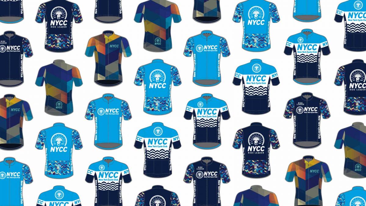
And so the Board consulted with, and then hired, a very talented designer and Club member named Alex Klafehn to give us new colors, new kit and a new logo. We also did some free-thinking: given the variety of NYCC jerseys that are currently on the road, why offer just one design at a time? In the work that follows you’ll see four thematically-related but different jerseys and a coordinating vest that is different still. No, we're not asking you to vote for your favorite; we're going with all four. I like all of them, and I hope you will too. And yes, there will be coordinating shorts, arm warmers and a cap, and there will be women's sizes.
You will also see a proposed new logo for the Club. I say “proposed”, because under the by-laws no logo can become the Club’s official logo, unless approved by the membership (who may instead vote to keep the current one). That vote will happen early in the new year.
Without further ado, let me introduce the designs.
Here’s the proposed logo:

Keep reading for Alex Klafehn’s summary of how he (and we) got here:
There’s plenty to look at here, so take your time. All of us on the Board look forward to your feedback.
Peter Storey. President
Origin Story
By Alex Kafehn
Way back in February, I was approached to help design the jerseys for Escape NY. Looking back into the history and context of the club was one of the first steps of the process, and I noticed a trend with NYCC’s logo and jerseys — namely, we lacked a strong unifying thread that linked everything together. We use a lot of reds, blues, and blacks, but there’s no official NYCC “color”, and while the logo has a clever integration of the bike with the “CC” letters, it struggles with visual imbalance and various club designers over the years seem to have relegated the logo to a small icon on the jersey rather than the forefront of its design.
With the recent explosion of interest in cycling, it seemed like a great opportunity to revisit the club’s branding, and present new and potential members with a logo and jersey that best represented the core values of the club. Jersey pockets full of these requirements, I went back to my desk and developed what you see now, guided by our effervescent Board of Directors.
Holding a Torch for Lady Liberty
While brainstorming ideas about how best to represent the club as a “New York” club, the Statue of Liberty came to mind — what’s more New York than the Statue of Liberty? Well, knowing where to actually find the best bagels and complaining about de Blasio, but I can’t put that on a cycling jersey.
Curiously no one hires me to write jokes, though for what it’s worth Lady Liberty does actually represent a lot of positive qualities that we strive for as a city and a club. A landmark and a city icon, she welcomes and is markedly inclusive of the incredibly diverse group of people who choose to make NYC their home, just as we work to make NYCC a welcoming and supportive club.

The image above shows some of the highlights of the iterative design process that went into the logo; first starting out with some rough sketching of how I wanted her face to look, then greater and greater refinement until we arrived at the final design.
In addition to the logo, we also wanted to establish a specific set of colors that best matched the values of the club. Open, welcoming, inclusive, stable; they also had a more utilitarian purpose of providing a color palette for any kit designs to be attractive and visible while on the road. A crisp azure was chosen as the primary color with a warm butterscotch yellow as a contrasting secondary color. Anchoring these brighter colors are a granite gray and deep ocean blue; together they form a unique color scheme amongst the NYC cycling scene while providing a diverse color palette for future work.
 Developing A Fashion Sense
Armed with a new logo and color palette, the next steps were to develop a core set of kit options for the club. Previously we had focused mostly on providing just one single design for a club of nearly 3,000 members — a venture almost doomed to fail as there was rarely a design that ticked a box for each individual. Instead we want to provide a collection of items, with each piece sharing a common theme but retaining its own separate individuality. This way they could be mixed and matched to build a greater and more diverse identity overall.
To provide that common theme, I explored a number of basic shapes and textures, with a particular eye towards accessibility and longevity. I’m just one of many designers in the club; I’d like to make sure there’s a solid foundation for anyone else to create unique and compelling pieces of work that still seem wholly NYCC. Ultimately I landed on the chevron concept, with a dappled texture that utilized various opacities and color values of the new NYCC colorway to create depth and enable unique permutations for each piece of kit.

Looking Up The Road
Starting out, we’ve got four jerseys available, each with their own identity as mentioned above:
- NYCC Prime/NYCC Ride Leader — the primary kit for the club, these utilize the new logo as the centerpiece for the design, with the clean single-color front/back panels counterpointed by the chevron texture on the sleeves and pockets.
- Classic NYCC — a throwback to 70’s jersey stylings, this jersey distills the chevrons to their most basic components to create a pared down design with only the essentials.
- Signature NYCC — a personal design of my own; the bright copper and patina of Lady Liberty is added to the new NYCC color palette, massively overscaling the base pattern and layering its shadow against it to make a warm yet muted design.
NYCC has thrived as a composite of the diverse identities and backgrounds of its membership, and it's been our goal with this project to provide folks with a distinct yet cohesive set of kit to reflect that. This has been an incredible project to work on, and I can’t wait to see it out on the road!
— Alex
When will the Jerseys be Available?
We plan to have samples and fit kits at the holiday party so all attendees will have a chance to see the design close up and decide on sizing. The order form will be posted to the website early next year. Look for details about the holiday party within about a week.
Volunteer Incentive Program
The launch of the new jersey design allows us to kick off our annual volunteer incentives program, when we give our volunteers club gear as a small thank you for all their contributions. However, we recognize that our 2020 volunteers deserve a bigger thank you than ever before; leading rides in 2020 was not easy, and those of you who took on those challenges made a tremendous contribution to our club.
The volunteer incentive program for 2020 will be simple: if you led five or more rides in 2020, we'd like to buy you a jersey or other item of your choice. We already know who you are, and we'll send you a coupon once gear is available for order. There will be no mandatory rules or complicated forms. All you'll have to do is pick out what you'd like.